After winning his 2nd Stanley Cup with the Philadelphia Flyers in 1975, Bill Clement was traded to the Washington Capitals.
It was a trade that would lead to perhaps the worst photo editing job on a trading card to that point, setting the standard for “bad photoshop” in the card industry from that point forward.
But first some background.
Bill Clement was a hot commodity
The Flyers of the early-1970’s, aka “The Broad Street Bullies”, were led up front by Bobby Clarke, Rick MacLeish, Bill Barber, and Gary Dornhoefer. Those players scored most of the goals and caused most of the problems for opposing teams.
But there were plenty of role players on those Flyers teams as well. One of those was Bill Clement.
Usually deployed as Philadelphia’s 4th line center, Clement was big, tough, and had a defensive edge to his game. He was a decent passer and an average shooter. Unlike most of his Flyers’ teammates, he did not find himself in the penalty box that often, racking up “only” 166 penalty minutes in his four years in Philadelphia.
(Dave Schultz, known enforcer for the Flyers, amassed 259 penalty minutes in the 1972-73 season alone.)
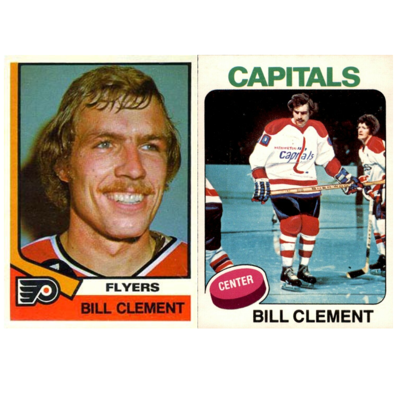
With two Stanley Cups under their belt, the Flyers front office decided to capitalize on Clement’s trade value. They sent him to the Washington Capitals in exchange for the #1 overall draft pick, who the Flyers used to pick Mel Bridgman.
The Capitals, about to begin only their 2nd season in the NHL, made Bill Clement their captain immediately. He would be the face of the franchise, showcasing the team’s first and best offseason acquisition.
That left the design team at O-Pee-Chee, the Canada-based hockey card manufacturer, scrambling. They couldn’t put out a set of cards that year that excluded one of the team’s captains, but all the Bill Clement photos they had were of Clement playing for the Flyers.
And thus, the single worst photo editing/paint job on a hockey card was born:
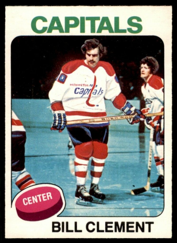
What you have here is a crude painting of a Washington Capitals jersey with Bill Clement’s disembodied head stuck on top. The jersey doesn’t look right. The pants don’t look right. Perhaps most noticeably, the chest logo looks as if it melted off the page during the artistic process. (Here’s a good look at what the logo is supposed to look like). Also the fans in the background have been blacked out, presumably to cover up the shoddy paint job in the foreground.
Clement’s normally balanced and intimidating stance have been emasculated by the cartoonish drawing of his legs and arms, painting him as a gangly traffic cone about to topple over. He looks less like a hockey player and more like a timid middle-schooler trying to remember where his feet go during the school dance.
The photo editing job looks that much worse when you see it alongside other Capitals cards from the same set:
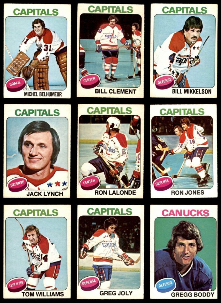
Hey, those look like real hockey players, wearing real jerseys, skating on real ice, in front of real fans!
A photo editing job that didn’t need to happen
In the interest of not piling on whoever committed this tragic artwork to paper, the folks at O-Pee-Chee were not left with many choices. They needed to include Clement in the set as a Capitals player, but had only a few short weeks to make it happen.
Modern day card manufacturers like Topps, Panini and Upper Deck, don’t have the same issues. For one, they have much better photo editing software and advanced computers to help manage the card design. But even then, I imagine they would have just settled for the old photo in this situation. In retrospect, O-Pee-Chee could have simply used an old photo of Clement in a Flyers’ jersey as long as the card indicated that Clement was now a member of the Washington Capitals.
In subsequent years of card design, manufacturers began to do just that: include the old photo of the player in his old jersey, but have the team name indicate the move to a new team. Perhaps they realized manufacturing a card in which the team name and photo don’t match is preferable to a potential photo editing nightmare… like with the 1975 O-Pee-Chee Bill Clement.
But then, of course, there is the idea of collectability.
As you might expect, there are some folks out there who adore this Bill Clement. They consider it a treasure of the vintage card era, a time in which technology and industry standards had not taken precedent over what collectors might want.
It’s a relic of a simpler time, or at least a time in which card manufacturers tried their hardest to give customers a quality product.
And while the monetary value of this Clement card is nothing to write home about (a PSA 10 copy of the card sold for just $52 back in 2010), the history behind the card and the lasting impression the photo has on any collectors that come across it make it an especially unique item to collect.